Interview with Ciphers designer James Perkins
20th Aug 2013
James Perkins is the set designer for Ciphers. He has previously worked with director Blanche McIntyre on Liar Liar, The One True History of Lizzie Finn, and Dawn King’s previous play Foxfinder.
What is the start of the process for designing a play?
I read the script a couple of times before I start, and then re-visit it two or three times throughout the research process. My next step is always to create a mountain of images that are inspired by the script. Ciphers is at 400 pictures and counting!
Here are just a few of the images that helped unlock the Ciphers design for James.
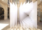
- Reframe, architectural installation by Paul Scales and Atelier Kit. http://www.dezeen.com/2012/08/16/reframe-by-paul-scales-and-atelier-kit/
- The Other Wave, painting by Barnaby Furnas http://www.anthonymeierfinearts.com/artists/barnaby-furnas
- This photo by Camille Seaman is a colour reference
- A combination of Turing’s life and the machines he inspired. http://www.gizmodo.com.au/2012/03/how-to-build-turings-universal-machine/
- “Chroma C” is a dance piece by Richard Davies (set by architect John Pawson) http://www.dezeen.com/2007/01/03/john-pawson-on-stage-at-royal-ballet/
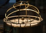
- Brass orreries – maps of the planets. Think Dark Crystal, or something more high brow. http://commons.wikimedia.org/wiki/File:Grand_orrery_in_Putnam_Gallery,_2009-11-24.jpg
- “Messy desk” design from dornob.com http://dornob.com/really-messy-desk-design-works-for-real-working-spaces/#axzz2cQi36Ii0
- Anthony McCall. “Crossing the Hudson (April 12, the 295th Night)” (2009). Sean Kelly Gallery Nov. 18, 2009. http://lightlandscape.stormking.org/artist/mccall2.html
- A painting of a blackbird by Gary Hume as a colour and composition ref. http://www.telegraph.co.uk/culture/art/art-reviews/10096949/Gary-Hume-Tate-Britain-review.html
- Gormley almost always crops up in one form or another, this time in reference to lines in space rather than bodies in space. http://www.antonygormley.com/sculpture/item-view/id/240#p24
How prescriptive is (director) Blanche McIntyre?
Blanche manages to be clear about what she does and doesn’t like whilst at the same time being very open to ideas. Her interests are broad and she maps a production in quite a visual way. We’ve worked together a few times so can move through ideas quite quickly.
What are the unique challenges and opportunities for Ciphers?
It’s a fast moving, almost cinematic script with a lot of short scenes, so the key to the design is in the transitions rather than the scenes themselves. It’s set in a world that the audience “know” quite well through TV and film, so there’s less need to stick to naturalistic details to explain each space to them. Once the rules – the visual language – of our world are established we can move from location to location quite quickly.
What have you come up with?
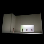
The set is a series of oversized photographic slides, which can truck across the stage to create new spaces throughout the show. It’s a world of information, voyeurism, collections, connections and movement. The scale of the story feels both operatic and intimate.
How involved are you in the physical building and installation of the set?
Because of the moving parts the set could be quite technically intricate, so I imagine that Gary, the production manager, and I will talk things through in a lot of detail, in collaboration with the scenic builders too – their insight and expertise might lead to tweaks of the design.
With the moving elements you’re talking about, presumably lighting will play into that too?
Gary Bowman (the lighting designer) is another regular collaborator so again we have shorthand, which can speed up the design process. The lights will bring the space to life. If we can adjust the set to improve how it lights – for example which materials and finishes we choose – then we will.

The Girl in the Yellow Dress (Salisbury Playhouse and Theatre503)
Looking at your portfolio, your designs are very structural. And they’re conceptual without always being abstract. The Girl in the Yellow Dress for example, or Lost in Yonkers, they’re like cubist versions of a more naturalistic set: They’re “realistic” but you’re showing more than you’d see if you were just looking into a real room. But others are less evocative of specific locations. What do you think theatre design is there to do? How do you decide on an approach?
If theatre is about telling a story then theatre design is about building worlds in which you can tell that story.I think these worlds are built from two things: physical truths and emotional truths. Physical truths are details required by the script to tell the story, and which aren’t explicit in the dialogue. So, does the audience need to know the period? How accurately? Do we need to know immediately that we’re in a kitchen? How much visual information do you need to provide to know it’s a kitchen – fully fitted units or just a couple of taps floating to suggest a sink? In Ciphers there are plenty of scenes where Dawn has done the work for us; the first few lines tell you where you are (“what’s wrong have you never been in a hotel room?…”) or she uses a simple prop to provide the necessary clue (such as Peter with a rake in the garden).
Emotional truths are perhaps more interesting. We can layer visual information onto the script to enhance ideas that already exist. The set can push the feeling of being watched or trapped. What’s it like to have your life spiral out of control? To show an audience what they already know or expect is uninteresting, but imaginative and abstracted visuals can draw them into a story and keep them questioning themselves and the world. The design may not address these ideas directly it may just provide a space in which the cast and director can tackle the script head on.
Most design – not just for theatre – is about maintaining a balance between two seemingly opposing forces: intellectual vs instinctive, naturalism vs abstraction, explained vs oblique, cost vs quality and form vs function. Ultimately the job of the design and the designer is to serve the play. Not through simpering servitude but by challenging and championing the ideas and stories set out in the script.
Where do you turn for inspiration?
I visit museums and exhibitions, I read lots of magazines, books and websites – a current favourite is www.dezeen.com. Lots of the people I know are interested in similar things so talking in pubs works pretty well as a form of research.

James’ design for 1001 Nights and Liar Liar at the Unicorn Theatre
Are there design ideas in your head that you’re waiting for the right shows to apply/adapt them to?
I’d like to try 3D printing, and also printing onto wood, either flat or textured. Also, ideas have a tendency to feed from one project into the next – for Ciphers I spent quite a while looking at architectural felt. It’s a fascinating material, but it turned out not to be right for this design so I wouldn’t be surprised if it popped up in a later project.
Is there a famous play or musical you’ve always wanted to design? How do you see it?
Nearly a decade into my career and I’ve still not managed a Shakespeare! I’ve always liked the Tempest and I’d love to take on Hamlet or Macbeth. Eurydice by Sarah Ruhl is a beautiful script that would be great to tackle – zinc buckets catching water from rusty pipes, lots of string and sand.
Tell me about a stage design you’ve really liked?
Christopher Oram’s set for The Tempest at The Old Vic. The opening 5 minutes. Blue backdrop, rope ladder into a trapdoor, storm scene, clap of thunder, rope ladder released, all the cast fall into the trap, which slams shut, blue backdrop falls and is coiled into a small book that is lying at Prospero’s feet. He picks up the book and the play begins. When you’ve been hit with such a strong picture the production has you by the throat, it was a visual idea that left the audience totally open to the words, performance and story.
When did you know you wanted to be a stage designer, and how did that come about?
I knew I wanted to be an artist of some sort – sculpture felt too free and architecture felt too rigid. I hadn’t even realised theatre design was a career until a tutor on my art foundation course recommended it.
What other career would you have enjoyed, or indeed would you also like to pursue?
Butchers have always fascinated me. I don’t really want to be a butcher but I love people that are passionate about their work and I enjoy that some people are passionate about butchery, which is quite foreign to me. I don’t really know if I’m passionate enough about anything else, it would have to be design related, and I’d never be happy without plenty of people to bat ideas off. Maybe advertising design, but I don’t think I’d suit the achingly trendy headgear or facial hair.
Ciphers tours from 15 October


